
Personal project
CozyPaws — pet store e-commerce
End-to-end brand and product design for a pet store e-commerce experience — landing, categories, subscription box, reviews, and a connected mobile experience.
- Industry
- Personal project
- Expertise
- Brand / UX / UI
- Development period
- 2026
- Deliverables
- Landing / category / subscription / reviews / mobile
About the project
End-to-end brand and product design for a pet store e-commerce experience — landing, categories, subscription box, reviews, and a connected mobile experience.
Challenge
A pet-commerce concept needs to feel more personal than marketplace shopping without losing conversion clarity.
Result
A warm brand and commerce system that turns categories, subscriptions, and trust signals into one cohesive story.
Executive summary
The project in one scan.
- Status
- Personal concept / product study
- My role
- Brand / UX / UI
- Deliverables
- Landing / category / subscription / reviews / mobile
- Problem
- A pet-commerce concept needs to feel more personal than marketplace shopping without losing conversion clarity.
- Key decisions
- Created one coherent product system across landing / category / subscription / reviews / mobile.
- Outcome
- A warm brand and commerce system that turns categories, subscriptions, and trust signals into one cohesive story.
Context
CozyPaws is a complete brand and product design exercise for a pet-supplies e-commerce store. The work spans a landing page, product surfaces, a subscription-box flow, a trust-building reviews section, and a connected mobile experience.
The category is dominated. Amazon, Chewy, Petco. Differentiation in pet supplies isn't about logistics or price — it's about feeling like a brand that actually understands your pet. The brief: build something warm and trustworthy enough that a pet owner picks it over a marketplace they already use.
The work split into four design decisions, each below: the brand voice, the product taxonomy, the subscription framing, and the visual trust signals.
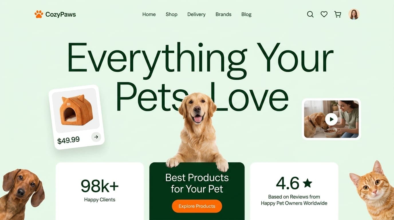
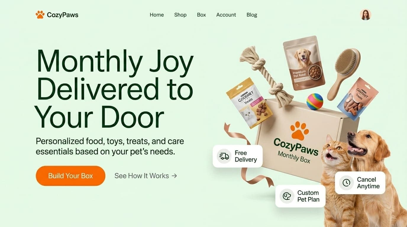
Decision 01 · Brand voice
Knowledgeable friend,not marketplace.
CozyPaws had to sound less like a logistics network and more like the indie pet-supply shop down the road. Every headline does that work:
- Hero: “Everything Your Pets Love” — not “for your pet”
- Featured: “Loved by Pets, Trusted by Owners” — pets listed first
- Reviews: “Happy Pets. Happier Humans.” — causal order, pets cause humans
- Subscription: “Monthly Joy Delivered to Your Door” — the experience, not the box
Typography is a single warm serif at large display sizes, paired with a clean sans for product cards. Color: warm mint-green primary, deep forest-green for headlines, vibrant orange reserved for CTAs only. The orange earns its conversion job without polluting the editorial feel.
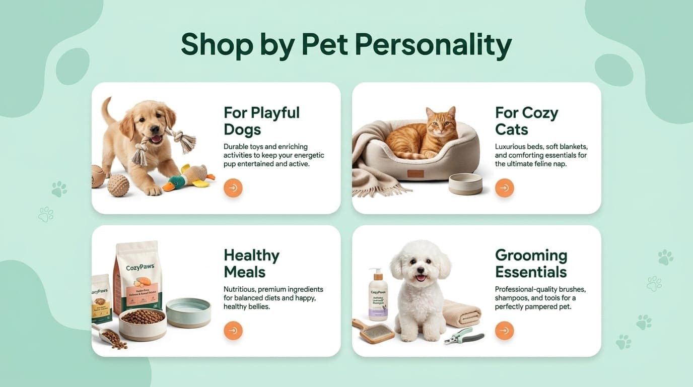
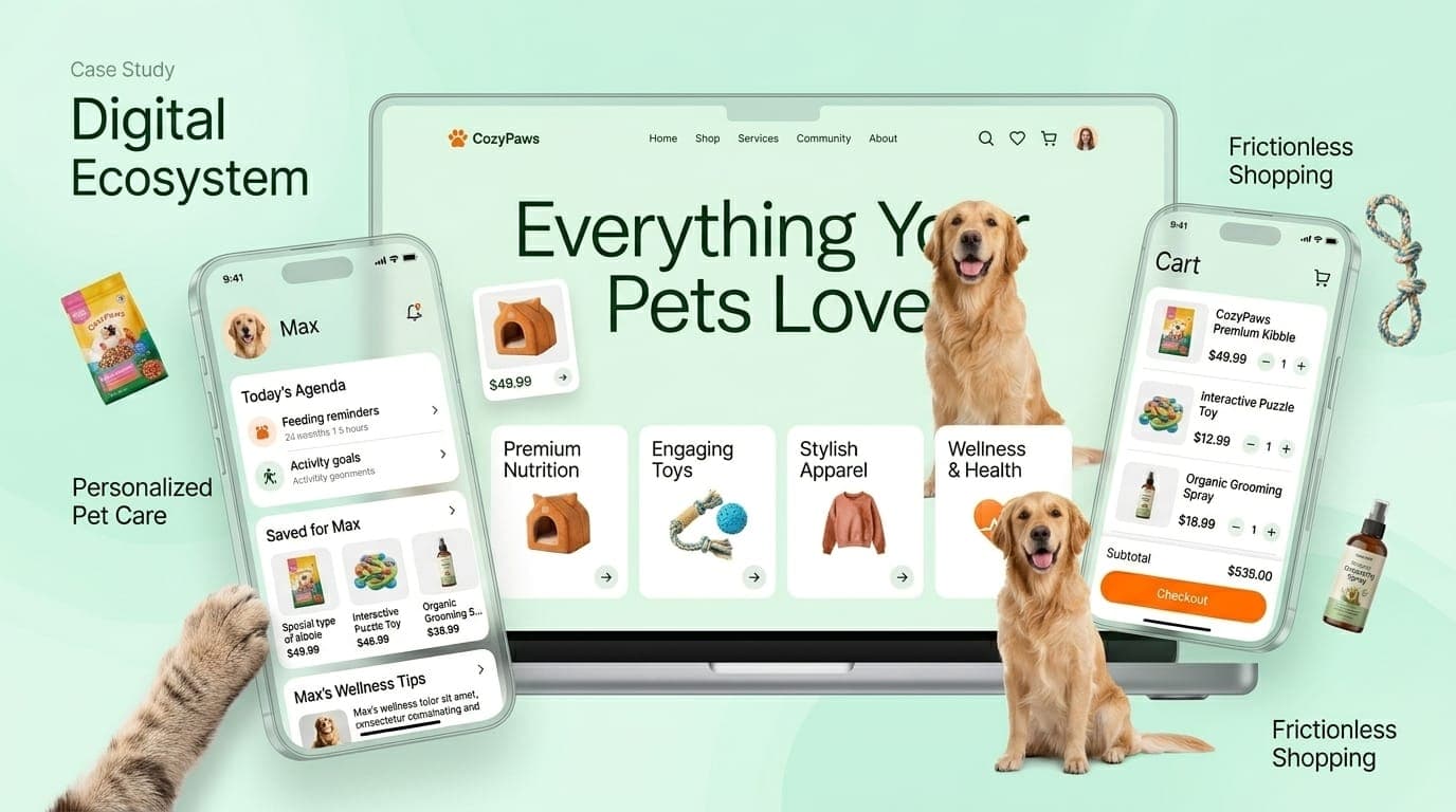
Decision 02 · Taxonomy
Shop by personality,not by species.
The standard pet-store IA is “Dogs · Cats · Small Animals · Reptiles.” CozyPaws does Playful Dogs · Cozy Cats · Healthy Meals · Grooming Essentials — personality and need, not taxon.
Reframes the relationship
A "playful dog" parent shops differently from a "dogs" shopper. They're already in a state of "what does my specific pet need" rather than "what's in this category."
Cross-sells naturally
A grooming category contains items from both dog and cat lines without forcing the customer to switch species filters.
Pets shown in context
Each card uses a real animal mid-moment — a puppy with a toy, a cat curled in a bed — instead of catalog product shots. The CTA arrow is a soft pill, not a hard 'Shop Now' button. Less aggressive, more inviting.
Decision 03 · Featured products
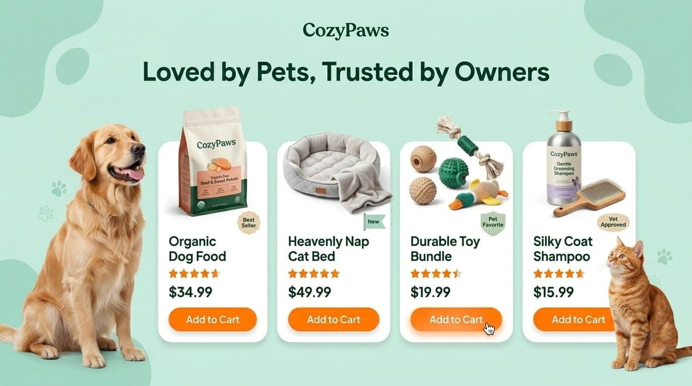
Five trust signals,one row.
The featured products row does five trust-building things at once. Read left to right:
CozyPaws-branded house products
Establishes own-brand credibility — not just a reseller.
Real product photography
Not stock, not vendor-supplied. Same lighting, same shadows across every product so the row reads as one composition.
One earned badge per product
"Best Seller", "New", "Pet Favorite", "Vet Approved" — varies. Every product gets one claim it owns instead of a generic "Premium" sticker on all.
Stars paired with price
Trust signal sits next to the conversion decision, not orphaned in a separate review count.
Single CTA color
Only 'Add to Cart' is orange. Everything else recedes. The eye is led straight to the action.
The pet bookends (dog left, cat right) frame the row — emotional cushioning around a commercial center. Pure commerce strips don't convert as well in pet-supplies; the affection has to be visible.
Decision 04 · Subscription
Monthly Joy,not 15% off.
Subscription boxes win or lose on framing. “Save 15%” frames the customer's wallet. “Monthly Joy” frames the pet's experience.
Hero is the box opening
The burst of products, the box centered, the moment of unboxing as the dominant image — joy made visible.
Three benefit cards
Free Delivery · Custom Pet Plan · Cancel Anytime. Each solves one of the three classic subscription objections — friction, fit, and lock-in.
CTA: "Build Your Box"
Not "Subscribe." Build invokes craft, control, customization. Secondary action "See How It Works" meets the customer who isn't ready yet.
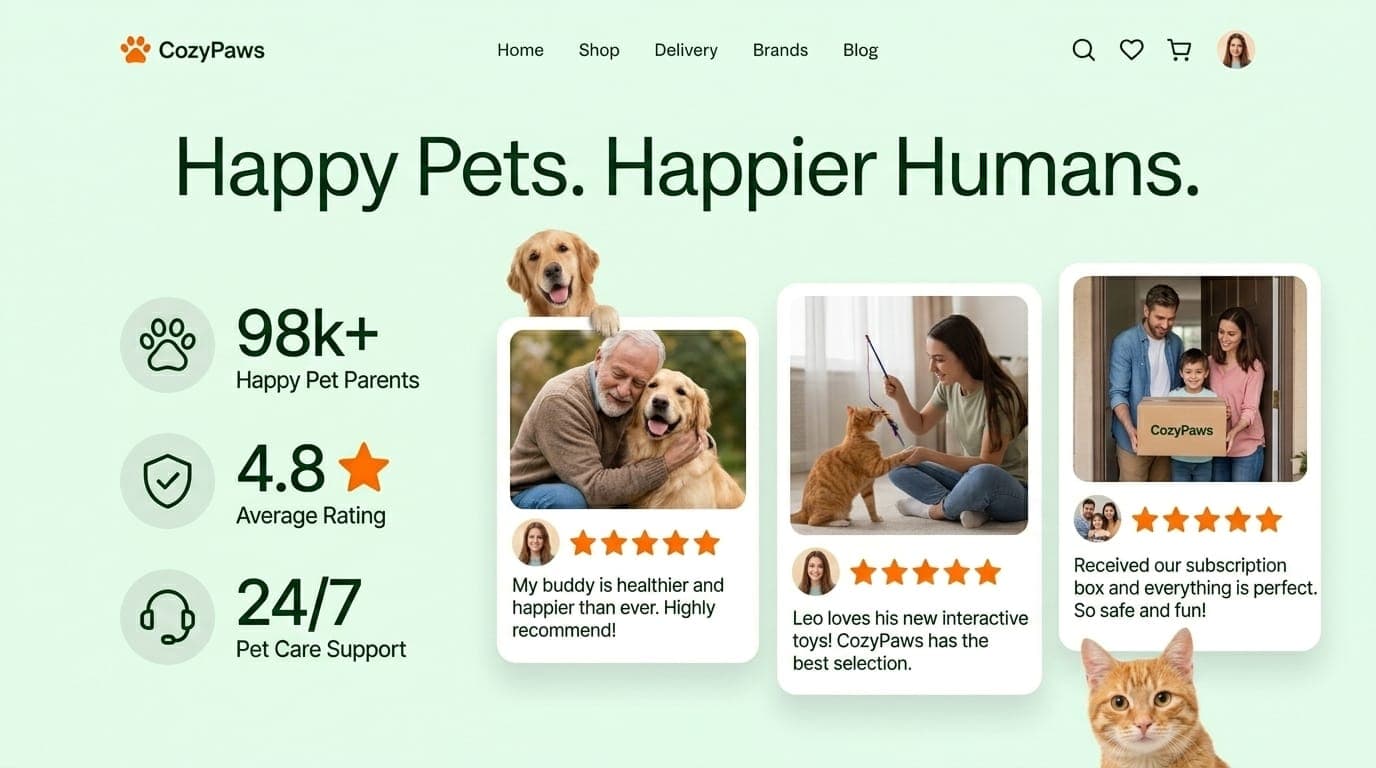
Decision 05 · Social proof
Pets and humans,in the same frame.
Most e-commerce review sections show stars, a count, and a list of testimonials. CozyPaws flips that pattern:
- Every review card shows the owner and pet together — not a stock avatar
- The star rating is tied to the customer, not aggregated
- Quotes mention the pet by name — “Leo loves his new toys,” “My buddy is healthier”
Combined with the three-stat header (98k+ Happy Pet Parents · 4.8 Average Rating · 24/7 Pet Care Support), the section delivers trust through humans paired with their pets, not metrics alone.
The full system
Web and mobile,one brand.
The closing shot shows the full design ecosystem: desktop landing flanked by two mobile screens — a personalized pet-care dashboard (today's feeding reminders, activity goals, wellness tips for Max), and a frictionless cart/checkout.
The brand carries across surfaces — same warm palette, same display serif, same orange CTA, same pet-first photography. The mobile companion extends shopping into care: appointment reminders, wellness content paired with relevant products, a “saved for Max” personalization. Pets become the unit of the account, not the cart.
Outcome
CozyPaws ended up as a full brand + product design system — covering brand voice, type and color system, photography direction, a five-surface web flow, and a companion mobile concept. It's an exercise in showing that e-commerce doesn't have to feel like a marketplace; warmth and conversion can live in the same UI when the visual hierarchy is right.
Biggest takeaway: taxonomy is a design decision, not an information-architecture afterthought. “Shop by Personality” alone reframes the entire shopping flow.
Role
Brand · UX · UI · Photography direction
Studio
Personal project
Years
2026
Surfaces
Web · Mobile · Brand system
Other projects
Kontrol Healthcare RCM SaaS
Kontrol / 2026